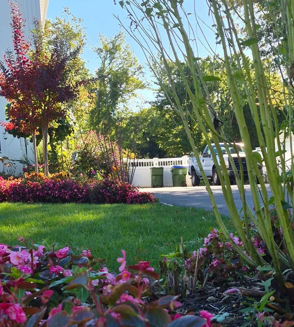
I keep noticing this garden in town. It is not subtle in color at all. Rows of pink begonias line the edges of the garden beds. Burgundy foliage appears in shrubs and small trees. Purple rose-of-Sharon bushes are strategically placed along the sides of the yard. Yet the reds, magentas, and purples that repeat throughout the property are not overwhelming. The bright colors bring energy to the space. Whoever designed this garden knew what to repeat, what to vary, when to stop, and what to leave alone.
Richness & Restraint
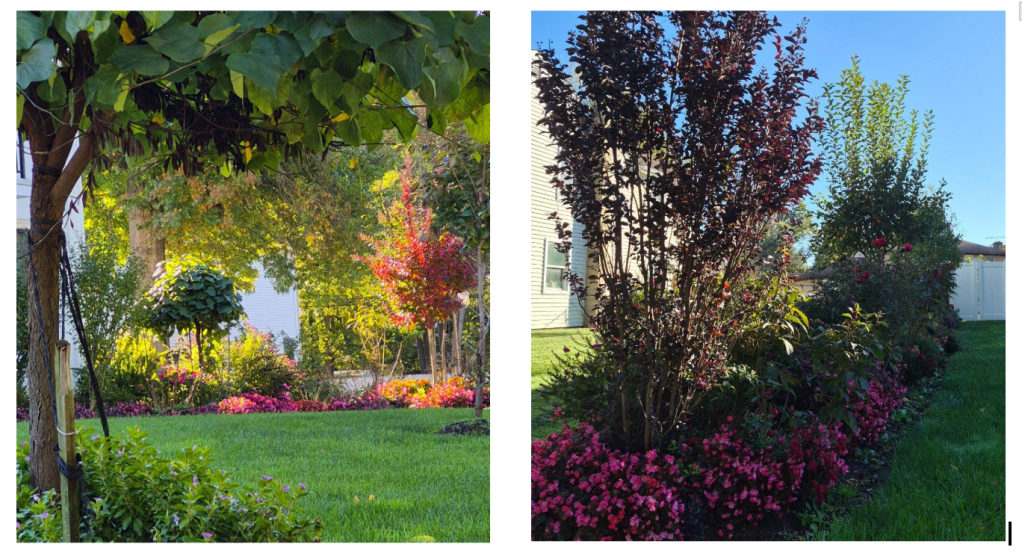
The most obvious feature of the garden is its red-purple color family. Pink, crimson, burgundy, wine, and plum appear in different plants, at different heights, and around the property. Despite this variety, the palette remains disciplined. Pink begonias edge the beds. Burgundy-leaved trees and shrubs punctuate the planting rather than taking over.
That autumn-inspired red-purple combination has a royal quality, and it is showing up in contemporary fashion, too. Celine’s recent collections have embraced striking combinations of grape purple and red. A restrained color family can feel dramatic without requiring every imaginable color.
In fashion, those saturated colors often get breathing room from neutrals. The same idea works outdoors: a bold palette feels more deliberate when it is surrounded by something quieter. The garden in my neighborhood sets its reds and purples against an expansive green lawn. That contrast makes the palette even more striking.

Raphael, Pope Julius II (1511–12), National Gallery, London
The expanse of grass and the leafy trees act as a foil for the reds. Red and green sit opposite each other on the color wheel. Placed beside each other, they can make one another appear more intense. The National Gallery explains this effect in its discussion of green in painting.
Raphael’s Pope Julius II offers a wonderful example. The pope’s red robes look especially rich against the green background. Even more interesting, Raphael originally planned a busier patterned backdrop before painting over it with green. In Jan van Eyck’s The Arnolfini Portrait, the vivid green gown also gains presence among the painting’s warmer tones. Sometimes contrast is what gives color its power.
Visual Relief
The reds and purples also benefit from visual relief. Negative space—the relatively open area around a focal point—gives the eye somewhere to rest. In the garden, the broad lawn is not an afterthought. It is part of the composition, much as an uncluttered tabletop lets a centerpiece take center stage. The negative space in the photo below draws our attention to the fruit arrangement.
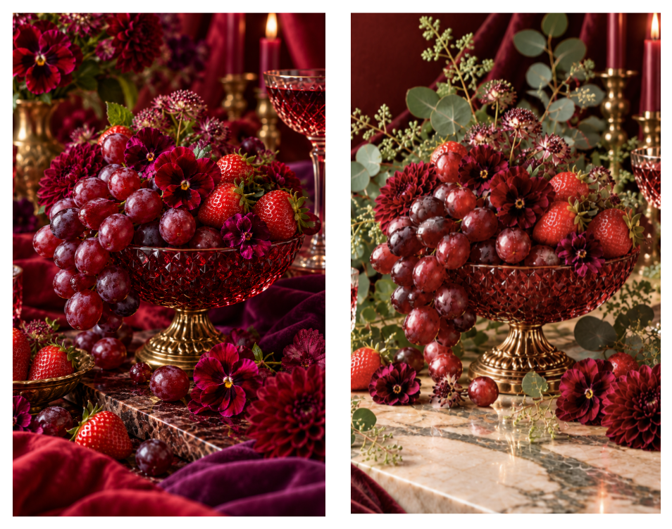
In the first still-life photo on the left, the red and burgundy background competes with the purple grapes and red strawberries. Nearly everything demands attention. In the second photo on the right, the addition of green foliage and the white tabletop gives the arrangement room to breathe. The colors have not lost their richness; they are simply easier to appreciate.
Interior designers rely on this principle as well. A burgundy sofa can be beautiful, but a room with walls, chairs, rugs, and pillows in the red color family competes for attention and feels oppressive. The open floor areas, natural light, pale stone, neutral walls, or greenery in the rooms below provide visual relief from the strong color scheme.
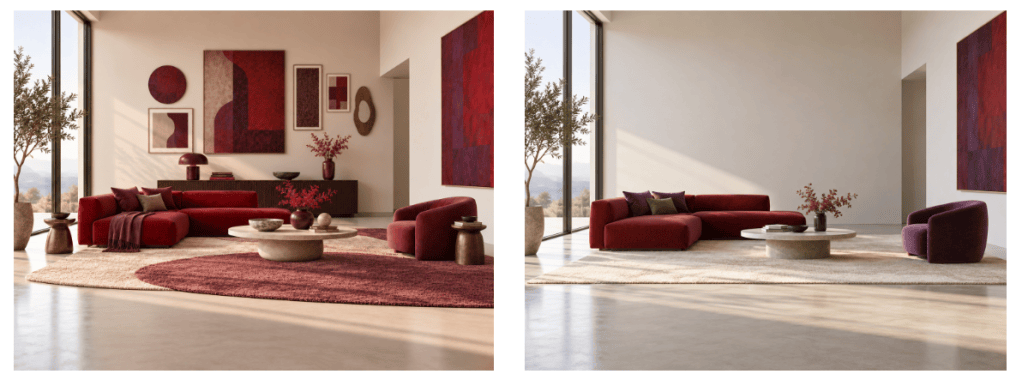
Both approaches in the photos above work, but each generates a distinctly different atmosphere. The left room has far less negative space than the room on the right. Its artwork, objects, and layered rugs create a fuller, more visually active environment. The bare wall and broad floor space in the photo on the right creates a greater sense of spaciousness and calm. What matters is how deliberately the space is used.
The beauty of the room on the right lies more in what is absent than what is present. The generous expanse of empty wall, the open floor, and the soft natural light give the rich reds and purples room to breathe. Nothing competes for attention, so each piece of furniture becomes more noticeable. The negative space creates a sense of calm, inviting us to pause, appreciate what is there, and imagine what might be.
The room on the left takes a different approach. It maintains the rich red-and-purple palette but introduces a greater variety of shapes and sizes. Circular artwork, rectangular frames, an oval wall accent, rounded furniture, and organic rug shapes create visual interest. Large paintings, medium-sized accessories, and small decorative objects add layers of complexity and richness.
Variety in Shapes & Sizes
Restraint alone would not make the garden interesting. If every plant were the same height, with the same leaf shape and flower form, the repeated red-purple palette could become monotonous. Instead, this garden varies almost everything except its central color idea.
Low, mounded begonias hug the lawn. Medium-height shrubs behind them add weight. Taller burgundy-leaved trees pull the eye upward. Rounded flowers sit beside upright branches while dense foliage contrasts airy growth. The result is a layered composition without a jumble of unrelated shapes.
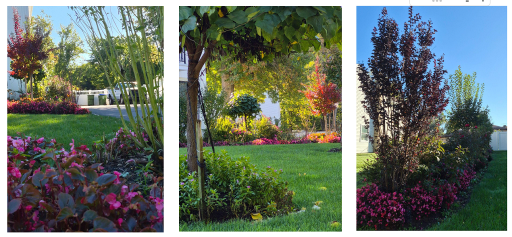
Repetition creates rhythm, too. Pink appears, disappears, and returns. Burgundy foliage in one corner echoes a tree elsewhere. These recurring colors hold the design together, while changes in height, texture, and shape keep it from becoming monotonous.
The designer has created continuity without sameness, variety without disorder, and abundance without overcrowding. That is a useful design lesson far beyond gardening. A room can do it. An outfit can do it. A still life can do it. And so can a front yard.
Designing with these ideas
Next season, I’m going to start with a small color family, repeat it in a few places, and let the lawn or a quieter area provide relief. The Royal Horticultural Society’s guide to planning a border offers useful advice on arranging plant groups, colors, heights, and textures. At the same time, I’ll add in different plant heights and leaf shapes, bringing in a few dark foliage plants like Wine & Roses weigela or Summer Wine ninebark.
Drop in a comment about your experiences with red, purple, and green in the garden. How do you vary the sizes and shapes of your plants? What plans do you have for next year?
More from Anchored & Aimless
For more ways to think about the spaces around us, browse the Design collection or all blog posts. New here? The Start Here page introduces the site. You can also subscribe for future essays.


Leave a Reply