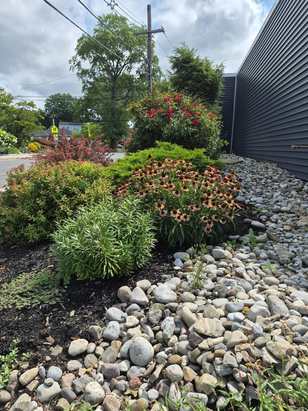
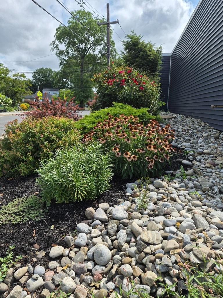
Every time I get out of my car and walk toward my chiropractor’s office, the landscaping gives me a polite and gracious welcome. It sits beside a dark gray building, a parking lot, and a busy street, yet the garden itself feels calm. The colors, textures, shapes, and gradual rise of the plants catch my attention every time I pass.
Why does this small garden work so well?
Is it the strong red-and-green contrast? The mix of soft foliage and heavy stone? Or the way the planting rises from low groundcovers to rounded shrubs, then to the rose and tall evergreen near the entrance?
I think it is all of those things working together.
Size and shape move the eye upward.
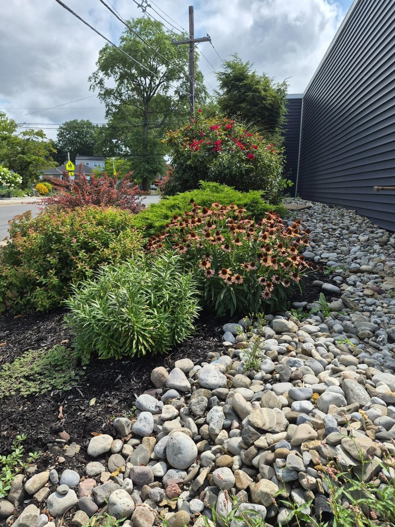
The garden begins low, with rounded river stones, black mulch, and spreading plants. Rounded shrubs rise behind them. Purple coneflowers sit higher still, followed by the red rose shrub and the large evergreen in the background.
The entrance is just beyond the evergreen on the right, so the planting gradually gains height as I walk toward the door. Nothing blocks the view. Each layer gives way to the next, and the repeated rounded forms make the bed feel connected without looking too formal.
The focal point is red.
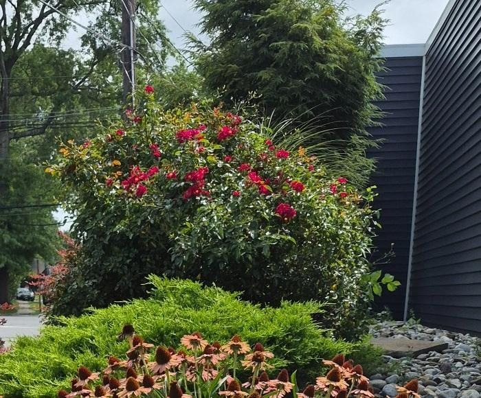
The rose shrub sits high in the planting and back from the front edge. It is not the largest plant in the scene, but its red flowers pull my eye toward it immediately. Most of the garden is green, gray, brown, and black, so the red has very little competition.
Red and green are complementary colors, which means they sit opposite each other on the color wheel. Illinois Extension explains that complementary colors create strong contrast and can make one another stand out. Here, that contrast gives the garden energy, but using one concentrated area of red keeps the garden from feeling busy.
The setting is part of the design too.
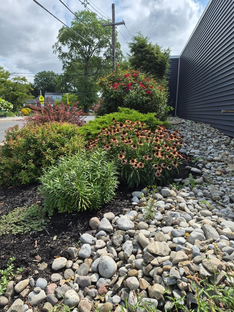
This garden is not in a quiet backyard. It sits beside a dark gray building, at the corner of a busy street, near a parking lot, and under utility lines. The charcoal-colored siding seems to belong to those harder surroundings. The pale river stone bridges the building and the planting, while the plants soften everything around them.
That contrast between setting and garden is part of the welcome. As I leave the parking lot and move toward the office, my attention shifts from cars and pavement to the rose, coneflowers, and rounded mounds of foliage.
Spacing creates balance.
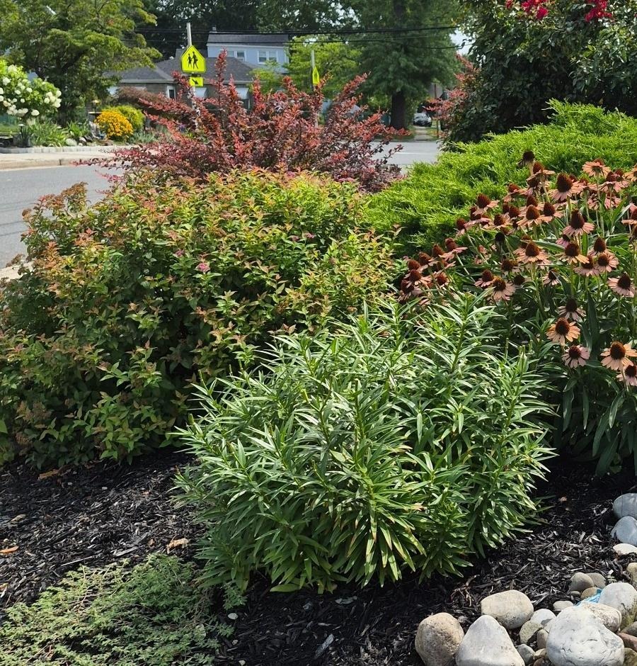
Low plants in front, rounded shrubs in the middle, and taller plants behind create a gradual rise. The plants are grouped closely enough to feel connected, but the major shapes still have enough room to read separately.
The coneflower mound is one group. The low evergreen has its own space. The rose sits back and above them. That spacing keeps the bed full without allowing everything to blur into one large mass.
Texture adds another layer.
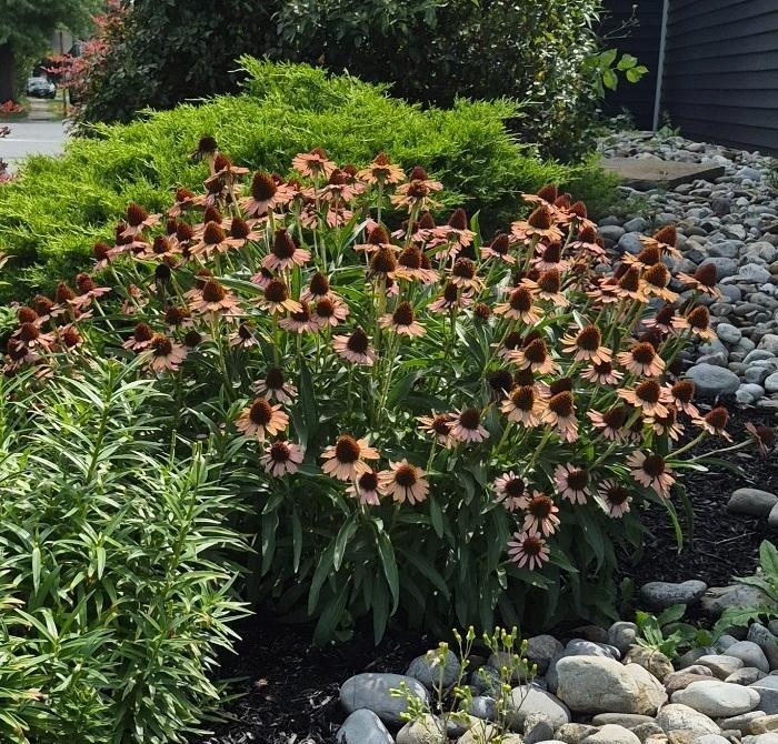
UF/IFAS Extension describes plant texture as a combination of leaves, stems, branches, and overall form, often considered as coarse, medium, or fine. I can see all three at work here.
The river stone has the heaviest texture. The rocks are large, rounded, and irregular. The coneflowers create a looser, medium texture. The narrow leaves in the front-center mound feel lighter and finer. The low evergreen behind the coneflowers is dense and soft-looking, creating a transition toward the rose shrub.
Surface quality matters too. The rocks are matte and irregular. The rose foliage looks darker and glossier. The coneflower centers are rough and bristly, while the finer leaves around them look smoother.
If I wanted to recreate the stone portion of this look, I would start by looking for rounded river pebbles and avoiding sharp gravel. A river pebble product like this would likely have a similar effect; what I like in the design is not one particular product, but the contrast between the heavy stone and the softer plants.
Maybe the real strength is restraint.
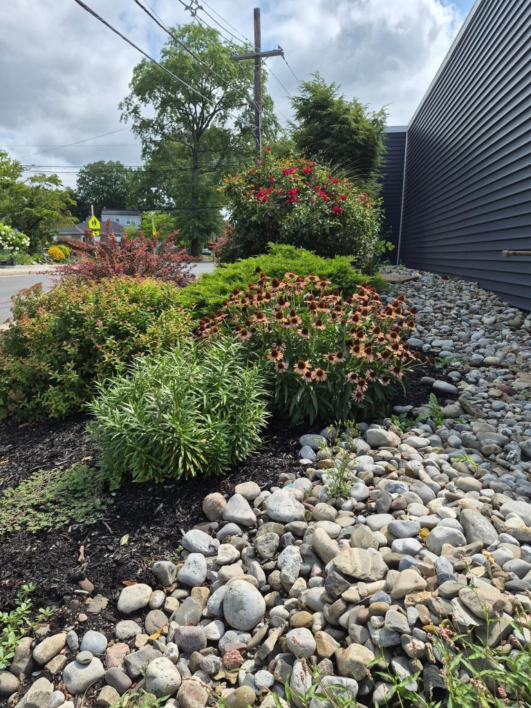
I do not think there is one trick that makes this garden work. The effect comes from several choices working together: the restrained use of red, the low-to-high layering, the mix of textures, the spacing between major plants, and the contrast between the garden and its busy surroundings.
Nothing feels overly formal, but nothing feels accidental either.
The garden creates a gracious transition from the parking lot to the office door, and I appreciate that welcome every time I arrive.
What about your garden? Is there a spot that feels especially welcoming—or one that still needs a little something? Maybe it’s a focal point, a change in spacing, or simply another texture or color to pull everything together.
Tell me about it in the comments. I’d love to hear what you’re working with—and maybe help you think through an idea for next year’s growing season.
If you enjoy looking closely at why everyday gardens work, explore more Design posts or subscribe to Anchored & Aimless to follow along.
Photographs in this post are by the author, Annaliese Degrassey.


Leave a comment